
 So today I'd like to talk about the Rock Racing's 2009 kit, or at least Rock Racing's February 2009 kit...and more specifically, Tyler Hamilton's kit.
I get it Michael Ball, you're a bad-ass, your team is full of bad-asses and the persona that you're so desparatly trying to project is one of bad-assedness...we all get it, you "don't follow the status quo", you're a "renegade" and you "march to the beat of your own drum". The whole grunge/spray-painted/grafitti-type of design you're going with is right in line with what you've been doing for a couple of years now. It's not exactly cycling jersey design style, but yet it's highly contemporary and as a designer I very much appreciate the envelope-pushing.
Of the Rock designs that have poured out of this team in the recent years, the one aspect that I absolutely love is how there is no limit to the portions of the overall kit that have been printed on. Head to toe, side to side, every inch of their kits is designed and printed. Some find them busy, and while I may tend to agree in certain designs, it's the evolution that I love.
Back in the day you only printed a strip on the chest of the wool jersey. The sublimation process eventually allowed for the entire jersey to be "decorated". Then they added a single panel on the side of the thighs, then a panel on the back of the shorts and now there isn't any part of the team kit that is off-limits to the design. For this I applaud you Mr. Ball, however, I have a few comments on Mr. Hamilton's kit specifically.
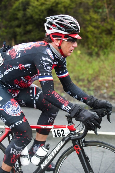
Tyler Hamilton, as in the U.S. National Road Race Champion Tyler Hamilton. I was expecting big things for Tyler's 2009 kit. I figured that Mr. Ball and his design staff would take the "stars and bars" theme and cram it down the throats of cycling fans worldwide! I pictured a gawdy display of the red, white and blue. I envisioned patriotic symbolism on Crack!
But what did we get??? A subtle touch of America behind the Rock logo that BARELY distinguishes him from the rest of his own team let alone the entire peloton. His stars and stripes on the sleeves of his jersey look more like he's a former US National Champion, not the current one.
 COME ON! At least get rid of the mainly black and replace it with a some blue. I had to really study Hamilton's kit just to see that they did anything at all! Garmin-Slipstream did an outstanding job of OBVIOUSLY incorporating the good ole' red, white and blue into Zabriskie's TT suit while still maintaining the signature argyle look of the team.
Sure, it says "US Road Champ" on the side panel of Hamilton's jersey, but with all the paint splatter and other elements, those words disappear into the jersey just like Tyler disappears into the field.
I know the Rock Racing team has had it's fare share of issues this past off-season and are probably behind the 8 Ball in many aspects of the team-management, they're even reportedly spray-painting their bike frames. My only hope is that when Tyler toes the line at his next race, Michael Ball will have gotten my message and rolled out an entirely new National Champions kit for him.
But I doubt it.